Website for a florist that has interesting flash effect with layers but i dont know how I feel about the moving navigation:
http://www.magnoliaflowersandevents.com/

Tuesday, November 30, 2010
Sunday, November 21, 2010
Saturday, November 20, 2010
Monday, November 15, 2010
Skinned Site for Album Reviews

I was reading this Kanye review on his new album and I thought the way they skinned the whole site to match each album review was interesting....It seems like they matched the fonts, background and color scale to each album ...scroll back and forth to see the various artists' reviews......This is a promotion for HipHopDX's "30 Reviews in 30 days"
What about usability though? via HipHopDX
Tuesday, November 9, 2010
"Prototyping Website Structure"
Prototyping Website Structure is an article that presents an analytical look at website structuring. The author focuses heavily on navigation and really takes a step by step look into the various processes of creating a website. The author has an interesting take on the creation of wireframes:
"I'm also uneasy with notorious wireframes. They're slightly more sophisticated than sitemaps--offering a lot more detail. The problem is, they're still presented on paper. And paper just doesn't work. In fact, the detailed nature of a wireframe, I believe, contributes to illusions of communication even more than sitemaps. That's because they look so thorough and detailed. The detail makes those who review them feel like the site has been thought out"
This is a good point/tip to designs and something I will definitely avoid since I tend to sketch. He also references Steve Krug's book Don't Make Me Think, and Information Architecture, by Peter Morville--which we talked about it class.

Definitely a great reference and worth checking out! Click Here
"I'm also uneasy with notorious wireframes. They're slightly more sophisticated than sitemaps--offering a lot more detail. The problem is, they're still presented on paper. And paper just doesn't work. In fact, the detailed nature of a wireframe, I believe, contributes to illusions of communication even more than sitemaps. That's because they look so thorough and detailed. The detail makes those who review them feel like the site has been thought out"
This is a good point/tip to designs and something I will definitely avoid since I tend to sketch. He also references Steve Krug's book Don't Make Me Think, and Information Architecture, by Peter Morville--which we talked about it class.

Definitely a great reference and worth checking out! Click Here
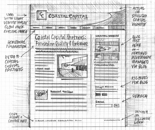
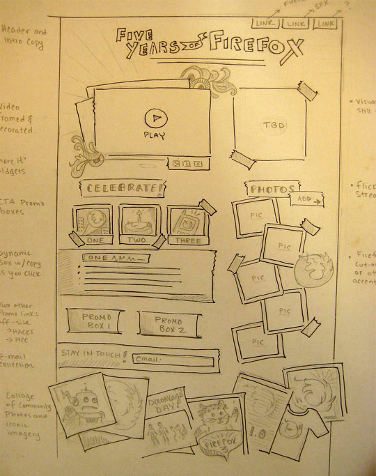
Wireframe hand-draw sketches
This site has a lot of good examples of Wireframe sketches and ideas on where to start. I also just like seeing things in sketch form:


Monday, November 8, 2010
Sample Fashion Websites
These are all high fashion sites--and made for shopping--rather than guides--but they serve as inspiration (they are all flash site too)
Armani: Nice use of typography and image--the layout is similar to my drawn site.

Marc Ecko is a blend between street and high fashion....I like the use of black and white and the linear nature of the layout:

Louis Vuitton: Another site that mimicks the simple layout with the navigation system on the left and the model figure taking up the majority of the layout.

Armani: Nice use of typography and image--the layout is similar to my drawn site.

Marc Ecko is a blend between street and high fashion....I like the use of black and white and the linear nature of the layout:

Louis Vuitton: Another site that mimicks the simple layout with the navigation system on the left and the model figure taking up the majority of the layout.

Tuesday, November 2, 2010
Jim Carrey website
Here's Jim Carrey's website which has a lot of flash. I think its done well and demonstrates how important it is to use appropriate media for branding---I think something less dynamic--just HTMl--wouldn't work well with his personality.
Monoface--flash website
Monoface is an interactive flash website where you can change the nose, face, eyes, and mouth to create different people. The concept is simple but the work is created almost flawlessly.


Monday, November 1, 2010
Friday, October 29, 2010
Sidewalk Art!!!
Im thinking about what direction I want to go in for the website design---I decided to focus on a theme; fashion, rather than a neighborhood. More specifically "street" or alternative fashion as oppose to high-fashion-week-fashion--more like make-shift stuff. So my starting point or inspiration is the sidewalk. Im looking at different images of the sidewalk itself and came across the website which I think is pretty cool---sidewalk art! CLICK HERE


Tuesday, October 26, 2010
Harlem Time Period: Malcolm X Movie Scene (No Water)
This is a scene from Spike Lee's Malcolm X during the period he lived in Harlem. I thought about this movie a lot while making my animation; and the style and dress among African Americans in 1930s-1940s Harlem. Although this particular clip doesn't show just how colorful, exuberant, and sometimes ostentatious the clothes were back then, I think it does give insight to the attitude and importance of style and appearance. (I had also wanted to use "Beans and Cornbread" by Louis Jordan, the track in the background--in my type animation but cant find the instrumental for the life of me!)
Graphic Inspiration
The graphics on Prince's 1999 album-- The illustrated look relates with my image animation for Harlem. I could easily imagine this animated...


Friday, October 22, 2010
Thursday, October 14, 2010
DJ Hero 2 - Mix 2Gether
I just saw this commercial and it looks like it was done with After Effects. The concept is nice but maybe they could of taken it a little further---the freckles part is dope though.
Tuesday, October 12, 2010
"Gettin' Money With a Mouse and a Wacom Pen (F*ck Comic Sans F*ck Papyrus, Too)"
This video is so unbelievably corny but they're talking about After Effects and other design elements--soo....enjoy. (I got some of the references, other not...)
Money Money Money - "Gettin' Money With a Mouse and a Wacom Pen (Fuck Comic Sans Fuck Papyrus, Too)" from Brad Chmielewski on Vimeo.
Motionographer
Money Money Money - "Gettin' Money With a Mouse and a Wacom Pen (Fuck Comic Sans Fuck Papyrus, Too)" from Brad Chmielewski on Vimeo.
Motionographer
Flash as an Educational Tool
Edumedia is a flash site that has educational demos for various sciences and other middle/high school classes...I wish I had this in school:
Tuesday, October 5, 2010
Video Magazine: Rockin that thang video
This is one of my favorite videos/songs. Although the type itself is not animated, the play on magazine covers--which are, of course print materials--mixed with the motion of video is a fresh take on magazine typography and design
Friday, October 1, 2010
The Natural and Technical; The Sound Of Violence - Cassius
This video infuses nature or natural shots with motion design. First it seems to be pretty much all video of landscape but towards the end, all these weird geometric figures appear. A lot of times digital art is thought of as something separate from maybe classic arts like painting, photography etc. which all traditionally deal with nature. This video presents the two concepts next to each other and has some simple animation infusing "the natural and the technical" which is pretty provocative. Something to think about.... Cassuis, "The Sound of Violence":
Tuesday, September 28, 2010
Repetition and Rhythm in Animation- Bla Bla Bla
This is an animation for the music video Bla Bla Bla by Gigi D'Agostino--Its a relatively simple animation but it demonstrates well, how sound/music enhances an animation (or maybe the other way around). The animation wouldn't be that great without the music. Another thing to point out is the video's heavy use of repetition--we're only seeing about 2-4 animated elements or characters but the creator still delivers a linear storyline with a beginning, middle, and end.
Here's another animation by the same artist using the similar characters and style as "Bla Bla Bla" but it uses color. The song is kind of annoying--but same effect: The Riddle
Here's another animation by the same artist using the similar characters and style as "Bla Bla Bla" but it uses color. The song is kind of annoying--but same effect: The Riddle
Monday, September 27, 2010
Kinetic Type Inspiration
Web Designer Depot lists "18 Creative Examples of Typography is Motion." Some use video and imagery and others are pure type. Most seem to be created in After Effects. The one below pertains directly to typography--giving an animated description of the typeface, Rockwell (Jordan Clarke):
Rockwell from Jordan Clarke on Vimeo.
Rockwell from Jordan Clarke on Vimeo.
Friday, September 24, 2010
Monday, September 20, 2010
Meet Dot, the World’s Tiniest Stop-Motion Animation Heroine
Meet Dot, the World’s Tiniest Stop-Motion Animation Heroine
"the smallest stop-motion animation ever produced — was made with a Nokia N8 smartphone and a CellScope" Vulture
"the smallest stop-motion animation ever produced — was made with a Nokia N8 smartphone and a CellScope" Vulture
Thursday, September 16, 2010
Art of the Title has a lot of good stuff on storyboards and layout from various title sequences features in movies and television programs.


Amiga - Disney Animation Studio (1990)
Amiga is one of the first animation programs developed and used by Disney. Above is a clip from 1990 (20 years ago!) showing how the program works but it seems relatively advanced for back then.
Tuesday, September 14, 2010
Diesel: The Brave New Commercial
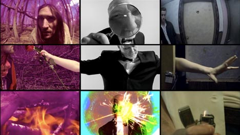
Although this doesn't involve animation, this video for Diesel is crazy. It combines 3 movies that, in the beginning, seem to have nothing to so with one another, but about halfway through they sort of merge or rather interact to create one piece. This shows perhaps, the more time you spend on concept development and planning, how outstanding a piece of work can be.
Motiongrapher says this about the film:
The three films in this triptych deal with themes of heart, mind and nerve. The centerpiece of mind narrates the other more abstract, non-linear pieces. Legs managed to mash-up a wide range of film vernacular in the process
I also think its interesting that the semi-avant garde, low-budget film was commissioned by Diesel.

Prologue Animation for MTV VMAs (2009)
I was trying to find out who did the motion design for the 2010 MTV VMAs because I really liked it although my Art Director/boss at work said it was way too busy and gave him a headache. I did, however, find out who did the animation for the last 3 years. Prologue, a LA-based live action and graphic design firm seems like they've done the opening design for the majority of Hollywood movies out right now. Their website is nice--and worth checking out. The nomination sequences for the 2009 VMAs below:
Going to keep looking for who did the digital design for the VMAs a few nights ago. (Also, loved Kanye's performance!)
Going to keep looking for who did the digital design for the VMAs a few nights ago. (Also, loved Kanye's performance!)
Tuesday, September 7, 2010
Future Music Video


The Wilderness Downtown is an interactive film/music video that filmmaker, Chis Milk put together w/Arcade Fire. It was built to run in Google Chrome and uses HTML 5. The video has been getting alot of media attention, ABC's website says,
"'The Wilderness Downtown' relies on HTML5 technology, a new web development standard that allows programmers to use web browsers in a whole new way. Windows pop open and closed in a choreographed fashion, and video, graphics, and text can be combined in real-time."
Sunday, September 5, 2010
Friday, September 3, 2010
harlem
I'm going to do harlem for my neighborhood and I have so many feelings, perceptions and experiences with the neighborhood that I'm sort of finding it difficult to hone in on just one aspect of the area. I've worked there, interned there, looked for apartments there, shopped there, hung out there, drank there, gone to shows there and the list goes on. I think I'm going to take the project away from my own experiences and focus on general perceptions of the neighborhood mixed with my own.
Subscribe to:
Comments (Atom)


